WEBSiTE DESiGN HiSTORY
Last Updated: 2025/01/04
To honor the time spent endlessly recreating this website, I will thereby list all of the design iterations it has gone through since it's inception in October 2016.The naming convention first states the type of design (classic uses a layout with a menu on the left, simple uses a single menu on index.html, combined has everything on one page), then the color scheme used.
| Classic Clouds | 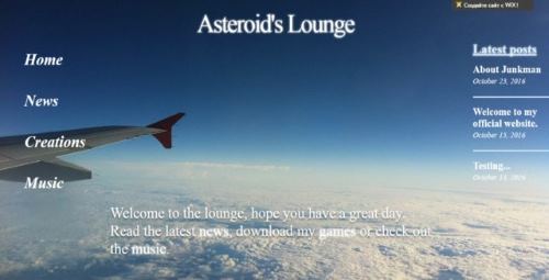 |
| Classic Red, featuring default google site stuff like a blogging feature and search, a well as RSS. | 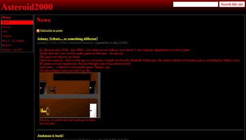 |
| Simple Red in all it's glory... | 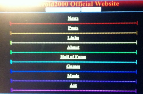 |
| One of Simple Red's sub-iterations? I have no idea. |
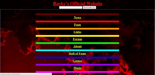 |
| The original version of Simple Colorful's game page, a list of links leading to one big screenshot and some basic info. I liked the blue background more so it stuck. | 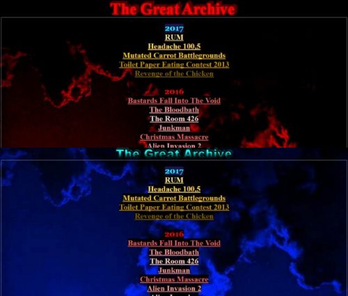 |
| Simple Colorful's index page. The good ol' days. | 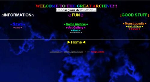 |
| Classic Yellow. | 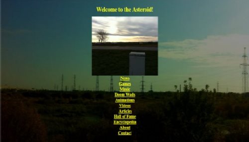 |
| Classic Dark. Random gifs are everywhere. | 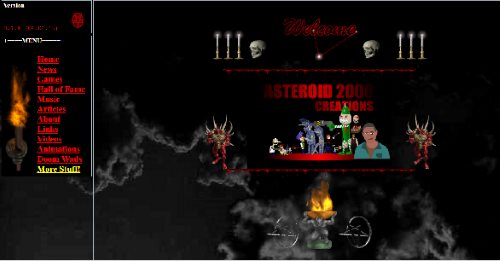 |
| Classic Colorful. Featuring an "Update Changelog" | 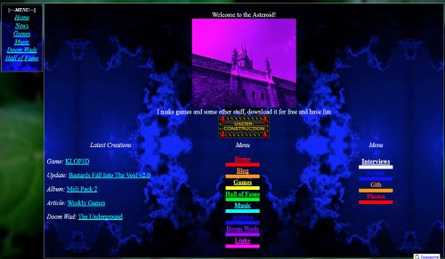 |
| Simple Green. You may recognize some of these images from my ACiD3D game. | 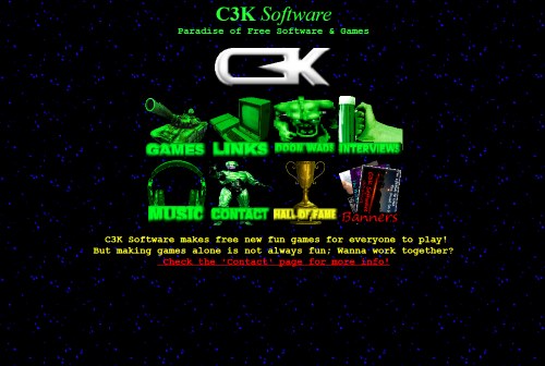 |
| Frame Red. You may recognize this particular design as being a rip off of someone else's... | 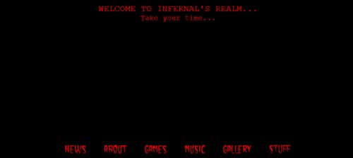 |
| Frame Colorful. The inscription on the rock says "Welcome to Zarrada". The menu on the left was.. not an iframe, despite apppearing on several pages. | 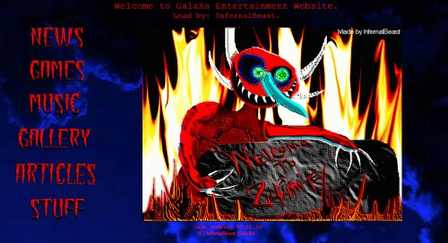 |
| Frame Fuchsia. Another favorite of mine. | 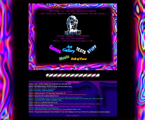 |
| Unused Classic Green. | 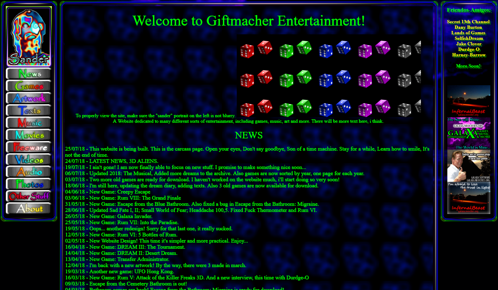 |
| Unused Classic Colorful 2. | 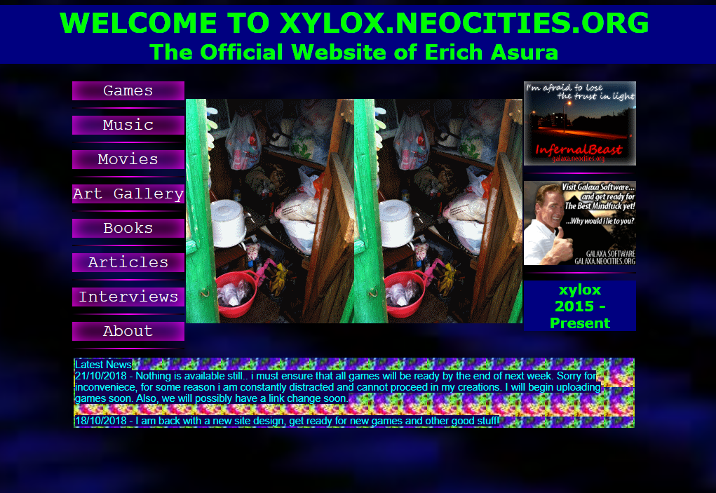 |
| Unused Hand-drawn. | 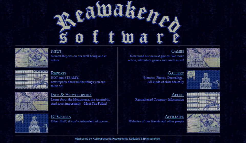 |
| One of the homepages of Black/Orange. | 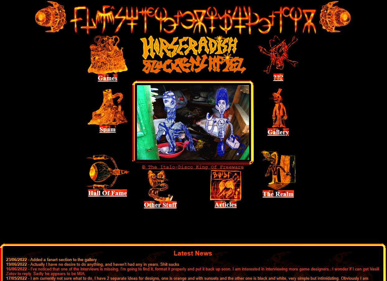 |
- Classic Clouds (Wix 2016.10.??)
This iteration didn't end up being used - Classic Red (Google Sites 2016.11.??)
During this time, the default blog feature was quite handy for posting news on the front page. The games page was a crappy table with links to full pages for each games as well as additional info and a single tiny screenshot in the other cells. - Simple Red (Google Sites 2016.12.3?)
Mostly same as before, but worse, with an ugly front page for some reason. - Unused Classic Cyan (Google Sites 2017.01.??)
Never used publicly. It was on a separate domain(#2) and was just me messing around with colors, without ruining the main site. Similar to Classic Red but with a different palette, among other things. - Simple Red 2 (Google Sites 2017.01.??)
An improved version, it's main feature was having even more menus and my logo between 2 red planets on the index page. - Simple Colorful (Google Sites 2017.02.2?)
I look back to this one fondly. Very colorful, wonderful design. From this point onwards the games page is almost always a 2 column table, screenshot on the left and info on the right. This iteration was on it's own domain(#3), I later moved it onto yet another(#4). - Simple Yellow (Google Sites 2017.04.??)
Classic Red but with a background and some elements from the last 2 iterations. The games page was the most complex: it was at one point split into 2 categories, one having links to full pages and the other utilizing the 2 column table layout from earlier. Additional pages for series like Rum were also listed, as well as reviews, collaborations and many other. This iteration was on the original domain. - Simple Dark (Google Sites 2017.05.??)
Same as before but with an ugly dark comically compressed jpg of a forest as the backgroundand plus a mangled color palette and simplified games page. - Classic Dark (Google Sites 2017.06.??)
The detailed pages of Classic Yellow combined with the layout of Classic Red. This version of the site is probably the most complete. It also had a shit ton of gifs for no apparent reason. The games page featured ratings on the scale of 5. - Classic Cosmic (Google Sites 2017.07.??)
Never used publicly. Used it's own separate domain(#5) - Classic Colorful (Google Sites 2017.08.??)
A less exciting version of the previous Classic Dark. Had a unique games page that split games based on their quality. - Classic Fuchsia (Google Sites 2017.10.??)
Never used publicly. Used it's own separate domain(#6) - Simple Green (Neocities 2017.11.??)
Due to the limitation of google sites as well as the imminent replacement of classic gsites with new (even more limited and ugly) I moved onto neocities. This design featured a unique take on the index page, having a menu comprised of images, as well as a very basic games page that didn't use tables for anything for the first time. New domain(#6). - Frame Red (Neocities 2017.12.2?)
An unfinished design. The link was changed(#7). - Frame Colorful (Neocities 2018.01.??)
One of the coolest designs, based on Simple Colorful. The games page was absolute nightmare fuel, a single list of links, each leading to a single small screenshot and some basic info, with html pages being named numerically. Featured an archive of most news reports from previous iterations. - Classic Black/White (Neocities 2018.04.??)
I don't remember why I made this one but I refused to use it after a day. The games page was split into convoluted categories and used more than 2 columns. The link was changed(#7). - Frame Fuchsia (Neocities 2018.05.??)
The fanciest of all index pages. Initially featuring lots of extra content beneath news reports. Later all the extra stuff was moved to Other Stuff. A simplified games page now had all games listed in one place, with 2 options, alphabetic or chronologic. The link was changed back to #6. - Unused Classic Green (Neocities 2018.07.??)
Only a half assed index page was ever made, but somehow it still took some time to make all the buttons for it so I think it's worth a mention. I stopped using Kompozer and moved on to using notepad at this point. - Simple Black/White (Neocities 2018.08.??)
Not sure what the idea was here, but it featured one unique element, an iframe for news on the front page. The link was changed(#8). - Unused Classic Colorful 2 (Neocities 2018.10.??)
Unfinished, featuring only the index page. Certain elements were later used in 2021. - Classic Clouds 2 (Neocities 2018.??.??)
The color palette, background and text shadows were taken from the Classic Clouds and combined with the layout of Classic Red. The link was changed(#9). - Classic Dark 2 (Neocities 2018.11.??)
A very barebones iteration of Classic Red. Only featured a games page and maybe some art. - Combined Colorful (Neocities 2019.01.??)
Everything I ever made crammed into a single page with random rants inbetween table cells and colorful marquees. - Glowing Red (Neocities 2019.07.??)
Everything I ever made crammed into a single page with random rants inbetween table cells and colorful marquees. The link was changed(#10) - Classic Red 2 (Neocities 2019.08.??)
An almost 1 to 1 recreation of the original, but on neocities and with some improvements. The games page had the fewest games but each game had it's own unique page design. The link was changed back to #9 - Unused Hand-drawn (N/A 2020.07.28)
During 2020-2022 I was greatly obsessed with my hand-drawn games (like Dad's Driving License) which prompted me to try making a design based on the same style. My website was down at the time, so I never used it anywhere. - Frame Fuchsia 2 (Neocities 2020.12.??)
A recreation of the original with some improvements. The link was changed(#11). I moved on from notepad onto notepad++ at this point. - Black/Orange (Neocities 2021.??.??)
The layout of most pages sans index remained the same, but the palette, background and additional decorative images changed. The link was changed(#12) - Classic Black/Orange (Neocities 2024.07.??)
You are here... The link was changed (#13)
Will there be more redesigning? Honestly I do want to make a new, cooler design, but seeing as I get lost every time I try (and have already spent far too much time on this stuff, for no real reason), I just postpone it. Wht I have now is more than satisfying though.
>>>Back To Articles...